I’ll be the first to admit that I’m a bit old-fashioned when it comes to phones. Everyone scoffs at my iPhone SE, but the truth is it’s the best phone Apple ever made[1] — a beautiful, well designed object in just about every way. But damn is the iPhone 11 Pro ugly. And so are the newest phones from Samsung and Google, while we’re at it.
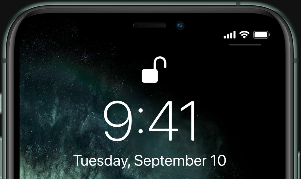
Let’s just get right to why the new iPhones are ugly, front and back. And sideways. We can start with the notch. Obviously it’s not new, but I thought maybe this would be some kind of generational anomaly that we’d all look back and laugh at in a year or two. Apparently it’s sticking around.
I know a lot of people have justified the notch to themselves in various ways — it technically means more raw screen space, it accommodates the carrier and battery icons, it’s necessary for unlocking the phone with your face.
Yeah, but it’s ugly.
If they removed the notch, literally no one would want the version with the notch, because it’s so plainly and universally undesirable. If Apple’s engineers could figure out a way to have no notch, they’d have done it by now, but they can’t and I bet they are extremely frustrated by that. They try to hide it with the special notch-camouflaging wallpaper whenever they can, which is as much as saying, “hey, we hate looking at it too.”

You can forget for a few seconds. But in the back of your mind you know it’s there. Everyone knows.
It’s a prominent, ugly compromise (among several) necessitated by a feature no one asked for and people can’t seem to figure out...